For shop owners, production leads, and foremen evaluating operator software, the real question is not whether a terminal looks modern. The real question is whether an operator can walk up to the screen, see what to do next, understand whether downstream capacity is ready, and open the part details without leaving the workstation.
Most shop-floor terminals fail in familiar ways. They show too much admin logic, bury the next action behind small buttons, or force operators to bounce between paper, drawings, and separate planning tools just to answer a simple question: “What should I work on right now?”
On a metalworking floor, that delay compounds fast. Parts pile up between cells. Rush jobs get mixed into normal work. Operators waste time chasing drawings or asking a foreman whether a downstream station can accept more work.
The useful standard is lower and more practical. A terminal should help the operator do four things quickly:
- See the current cell’s work without keyboard-heavy input
- Understand what is in process, what is ready next, and what is still coming
- Avoid pushing work into a downstream bottleneck
- Open the drawing, 3D model, and routing context from the same screen
That is the standard Eryxon Flow’s current Operator Terminal is built around.
It starts with a screen operators can actually use
The current Operator Terminal feature page describes a touch-first workstation view designed for tablets and large shop-floor screens. The basics matter here: large tap targets, no tiny controls, and no keyboard requirement for normal use.
That sounds obvious, but it is one of the biggest adoption filters in production software. If the terminal feels like an office application dragged onto a kiosk, operators will work around it instead of through it.
Eryxon Flow keeps the first decision simple. When the terminal opens, the operator picks a cell from the selector at the top. From there, the queue is filtered to that workstation so the screen reflects the work at that part of the shop, not the full factory noise.
For a foreman or owner, that is not a cosmetic choice. It is what makes a terminal usable on the floor during an actual shift change, not just during a software demo.
Operators need three queue states, not one long list
One of the clearest choices in the shipped terminal is the three-part queue:
- In Process for the work already active
- In Buffer for the work physically ready at the cell
- Expected for the work planned to arrive later
This is more useful than a single mixed backlog because it separates “what I am touching now” from “what I can pick up next” and “what is only planned.” That distinction reduces hesitation at the workstation.
The terminal also shows total estimated hours and total pieces at the bottom of each section. That gives the operator and foreman a quick workload read without opening a separate planning screen.
For production leads, this matters because queue clarity is often more valuable than more scheduling detail. A terminal does not need to be a second ERP. It needs to remove ambiguity at the moment work is pulled.
A terminal should warn operators before they create the next pile-up
The most practical signal in the current terminal is the POLCA-style cell indicator shown on each operation, such as Laser -> Zetten: GO or Zetten -> Lassen: PAUSE.
That signal answers two production questions directly on the queue card:
- Where does this part go next?
- Can the next cell accept more work right now?
If the next cell shows GO, the operator knows that finishing the work will keep flow moving. If it shows PAUSE, the operator can pick a different item first instead of feeding a bottleneck.
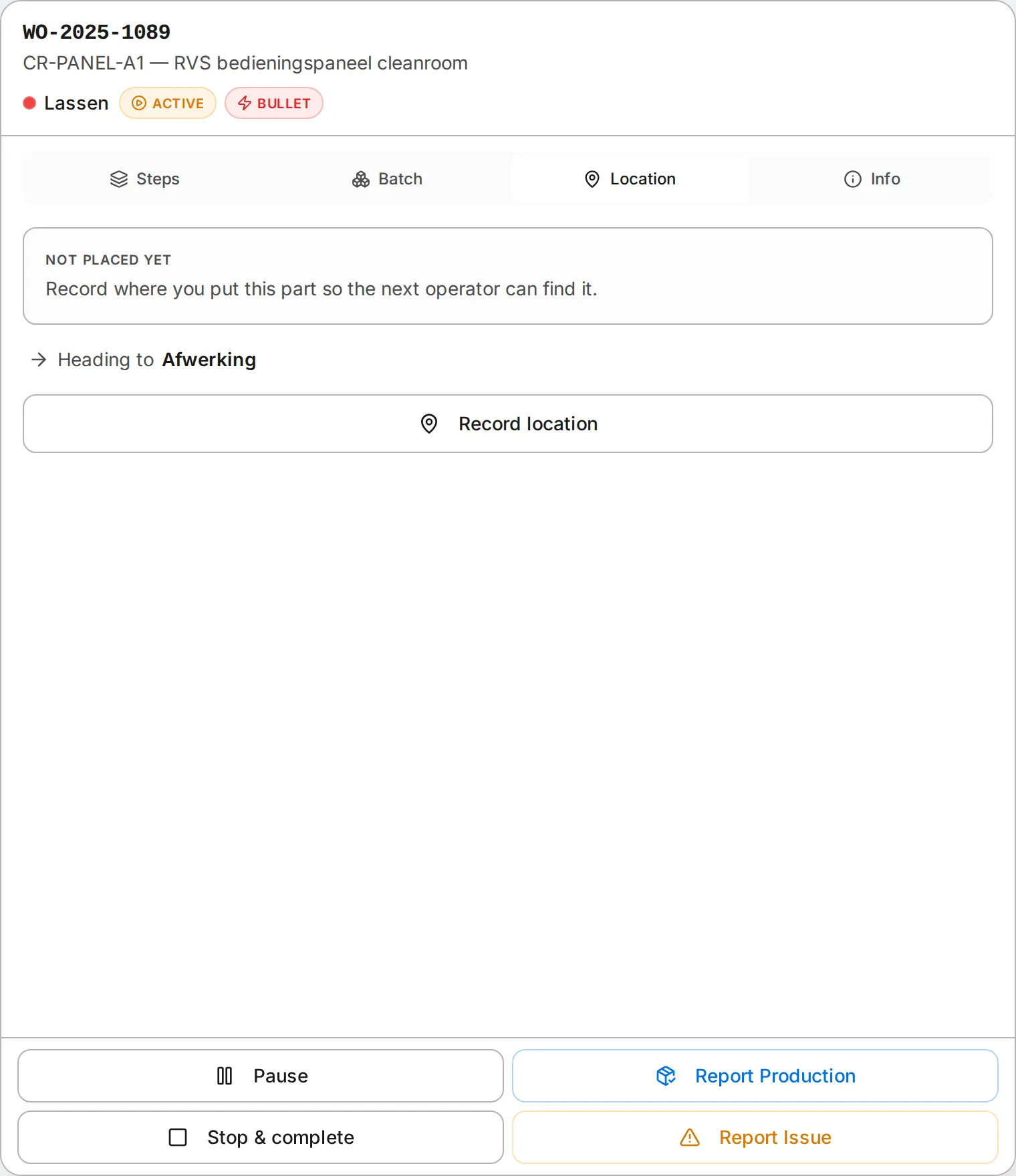 The Location tab keeps “where does this go next” on the same screen as the work (demo data shown).
That is the kind of signal operators actually need from a terminal. It translates scheduling intent into an immediate shop-floor choice. Eryxon Flow’s public introduction also frames the broader system around stage-based flow, real-time visibility, and QRM-style work organization rather than accountant-centric screens or static paperwork.
For foremen, this is also one of the easiest behaviors to coach. Watch the GO items first. Avoid filling downstream staging areas with work that cannot move.
Priority has to be visible without opening another screen
The terminal’s backlog status adds a second layer of decision support:
- Overdue for late work
- Today for work due today
- Soon for work due soon
Combined with the GO or PAUSE downstream signal, that gives operators a simple rule set on the same screen: overdue GO items first, then today’s GO items, then the rest.
Rush orders are made even more visible. In the current feature doc, they are shown with a red border and sort to the top of each section. That reduces the chance that a truly urgent job disappears inside a generic queue.
None of this depends on predictive AI or a complex optimizer. It is basic production discipline presented where the decision is made: at the terminal.
Operators should not leave the terminal to inspect the part
A terminal stops being useful when it only answers “what is next” but not “what exactly am I working on?”
The current detail panel in Eryxon Flow addresses that by opening the part context directly from the selected operation:
- A 3D Viewer to inspect the part geometry
- A PDF Viewer for drawings, work instructions, or customer specifications
- The routing view to show completed and remaining production steps
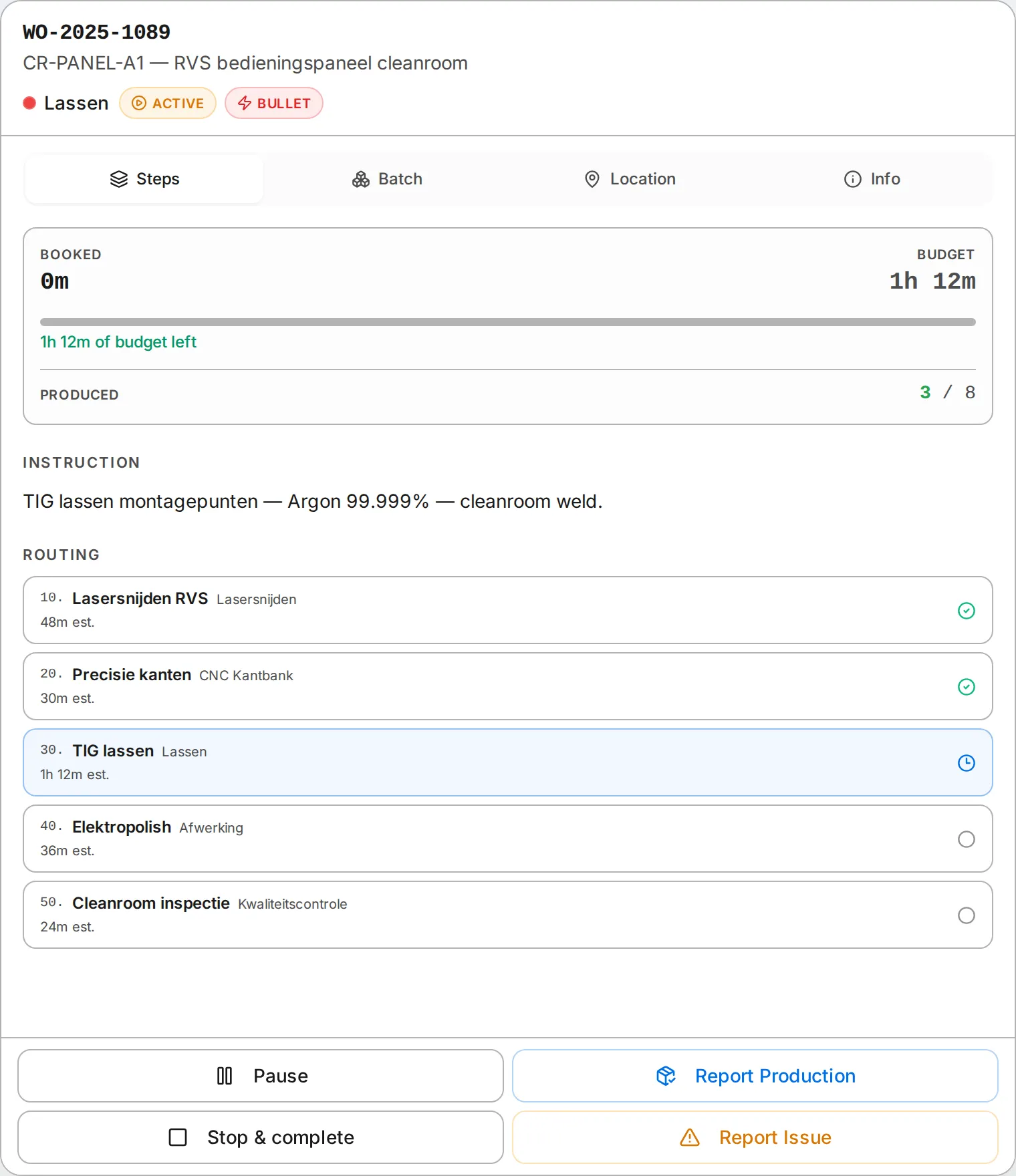 The detail panel opens the drawing, geometry, and routing from the active job card — no second screen (demo data shown).
This matches the broader product description in the introduction page, which highlights STEP viewing, PDF access, and stage-based work visibility for operators.
For a shop owner evaluating deployment fit, this is an important dividing line. If drawings, geometry, and routing stay disconnected from the operator queue, the software still leaves paper-chasing and interruption costs in place. If that context opens from the active job card, the terminal becomes a real workstation tool rather than a status monitor.
Management visibility still matters, but it should support the operator flow
The operator terminal is not only an operator convenience layer. It also makes the floor more legible to production leads and owners.
The public docs describe a system where admins can see who is working on what in real time, while the floor works from touch-friendly queues organized by production stage. That split is useful because it preserves two different needs:
- Operators need a narrow, immediate view of the work at their cell
- Production leaders need live visibility without constantly walking the floor
The terminal contributes to that by keeping operator state visible through the status bar, including the current operation, live timer, and active or idle status. It is a small detail, but it closes the loop between work execution and management visibility.
Where to go next
If you want to evaluate whether the terminal fits your floor, start with the Operator Terminal feature page to review the queue logic and workstation behavior in detail.
If you want to see the current product directly, open the hosted version.